7 Best Practices for User Interface Design
While you might think that user interface design is about making your website or app aesthetically pleasing, it's actually much more than that. It's about creating an intuitive, user-centric experience that drives user engagement and satisfaction.
When done right, good UI design can significantly boost user retention and conversion rates. To achieve this, you've got to stick to certain best practices. Let's talk about the top seven best practices for UI design that you should be considering, and why they could make all the difference in your next project's success.
Understanding User Goals
Diving deep into the realm of user interface design, it's essential to start with an understanding of user goals, a critical step that shapes the design process and ultimately drives your product to resonate with its intended audience. Identifying user needs isn't just a box to check off but a compass guiding every decision you make.
Think of user goals as your North Star, providing clear direction for a user-centric interface that enhances the overall experience. This understanding isn't a one-time event. You'll need to refer back to these goals continuously throughout the design process to ensure alignment.
This alignment isn't just about ticking boxes. It's about crafting an experience that feels intuitive, satisfying, and rewarding to the user. It's about user experience optimization that not only meets but exceeds user expectations, resulting in a product that doesn't just function but delights.
Designing with user goals in mind isn't just a best practice for user satisfaction. It's a strategy for success. A product that resonates with its audience has a higher likelihood of success, and it all starts with understanding and aligning with user objectives.
Researching Common UI Patterns
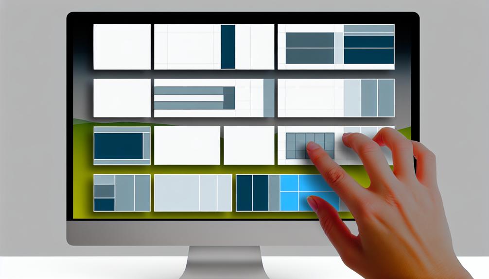
As you venture into the realm of user interface design, understanding common UI patterns becomes a critical stepping stone. The patterns you uncover not only shape user expectations and behavior but also make navigation a breeze for your users.
Understanding Common UI Patterns
Let's delve into the realm of common UI patterns like 'Hamburger' menus and 'Infinite Scroll', widely recognized features in today's interface design that you can harness to meet user expectations and adhere to industry standards.
Exploring design trends, you'll find 'Wizard' forms and 'Card' layouts are frequently used to streamline step-by-step processes and display content in an organized manner.
In evaluating user preferences, it becomes apparent that familiarity and usability are key. These patterns represent tested solutions that can enhance navigation and overall user experience.
Importance of UI Research
Why is UI research vital you might ask?
Well, it's the key to identifying and understanding the common UI patterns that successful designs frequently employ, which ultimately improves design consistency and enhances user experience.
By analyzing these patterns in popular apps and websites, you get a glimpse of user expectations, steering your design evolution. User feedback plays a crucial role in this research, shedding light on what works and what doesn't.
This insight not only helps in making design improvements but also in predicting user behavior, thereby enhancing the effectiveness of your UI design solutions.
In a nutshell, thorough UI research equips you with the knowledge required to create intuitive, user-friendly designs that meet user needs while staying on top of current trends.
Implementing UI Design Patterns
Diving into the realm of common UI patterns, such as navigation bars, modals, and cards, you'll quickly realize their fundamental role in effective UI design. Implementing these patterns isn't just about replicating what's already out there, but customizing interactions to suit user preferences. By personalizing experiences, you're aligning with the latest design trends while meeting user expectations.
However, don't just stop at what's established. Keep an eye on evolving patterns, ensuring your design remains current and relevant. Remember, it's about blending user goals with design trends to create a unique, user-centric interface. The trick lies in how well you adapt these patterns, creating a bespoke experience that's both familiar and innovative. By studying and implementing UI design patterns, you're paving the way for meaningful user engagement.
Establishing Design Consistency
Harnessing the power of design consistency, you can enhance user trust and interaction by seamlessly integrating UI elements, leading to easy navigation and a cohesive user experience. This not only creates visual harmony but also significantly contributes to enhancing user experience.
Imagine visiting a website where every page has a different layout, style, and color scheme. It's disorienting, isn't it? That's where design consistency comes into play. By implementing common UI patterns, you can solve design problems efficiently and improve user interaction and usability.
Evolving UI patterns are vital in providing a seamless design experience. For instance, users expect the logo to be at the top left of a webpage and the search bar to be at the top right. Such familiar UI patterns make navigation intuitive, reducing the cognitive load on a user.
In a nutshell, establishing design consistency is like organizing a symphony. Each UI element must play its part in harmony with the others to create a unified, pleasing experience. It's not just about aesthetics, but also about functionality and usability. So, while designing, remember, consistency is key.
Implementing Design Hierarchy
Just as a well-conducted orchestra keeps the audience engaged, a well-implemented design hierarchy can grab a user's attention and guide them through your interface, enhancing their experience and engagement. Implementing design hierarchy is like composing a symphony of visual cues, where each note – color, size, typography, and spacing – plays a crucial role in creating an engaging and harmonious user interface.
Color psychology is a particularly powerful conductor in this symphony. The right color scheme can guide the user's eye, emphasizing key elements and evoking specific emotions. Visual hierarchy, meanwhile, uses the size and spatial arrangement of these elements to direct the user's gaze, creating a natural flow of information.
But a well-implemented design hierarchy is more than just an art; it's also a science. Accessibility considerations ensure that your interface is usable by as many people as possible, taking into account factors like color blindness and screen reader usage. Your design should also consider the F pattern reading, a common scanning habit where users read in a pattern that resembles the letter 'F'. By aligning your design to these patterns, you can guide your users naturally through your interface, enhancing their experience and engagement.
Utilizing Effective UI Elements
In the grand scheme of user interface design, employing effective UI elements like layout, color, typography, and images can significantly elevate your user's experience, making interactions seamless and enjoyable. The layout is the skeletal system, organizing UI elements for effortless navigation and interaction. A well-structured layout is akin to a well-designed map, leading users on a journey through your content.
Color isn't just an aesthetic choice, it's an emotional one. Delve into color psychology, understanding the mood and feelings each hue evokes. Your color choices can shape user perceptions and emotions, imprinting your brand's identity on their minds.
Typography holds the reins of readability and hierarchy. Your font choice can guide users through your interface, emphasizing critical information and subtly fading back secondary details.
Images, they're the cherries on top. They support your text, add visual interest and assist in visual storytelling. A well-selected image can narrate a thousand words, reinforcing your message and enhancing the user's understanding.
Ensuring Action Consistency
Moving on to action consistency, you'll find that keeping actions like buttons or icons uniform across your interface not only enhances user familiarity but significantly reduces cognitive load. Consistent action placement, for instance, allows users to quickly find what they need, boosting user engagement and overall satisfaction.
Think of it this way: imagine if every time you went to your favorite coffee shop, they moved the register. It would be frustrating, wouldn't it? The same principle applies to your user interface. Your users shouldn't have to hunt for actions every time they navigate to a different page or section.
Visual hierarchy plays an equally critical role in creating consistent interaction patterns. By using the same color scheme for primary and secondary actions, you create layers of importance that guide users through their journey.
Furthermore, standardizing your action labels and icons leaves no room for confusion. Your users will appreciate the predictability and feel more in control. Lastly, consistent feedback for user actions, whether it's a success message or an error alert, reinforces this sense of control, making your interface not just user-friendly but a joy to interact with.
Regular Content Review and Adjustment
Keeping your UI design fresh and relevant requires regular content reviews and adjustments. It's crucial to evaluate your design frequently, paying close attention to user feedback and analytics data, to ensure that it continues to meet user expectations and aligns with the latest trends.
An iterative approach to content adjustment, focused on enhancing clarity and usability, will keep your interface engaging and user-friendly.
Importance of Regular Updates
Regular updates to your user interface aren't just a matter of aesthetics; they're a crucial step in ensuring your platform remains engaging, relevant, and user-friendly. This proactive maintenance enhances user engagement and shows your commitment to a high-quality experience.
Through regular content review, you'll spot outdated elements, ensuring interface relevance. It's not just about adding new features; it's also about fine-tuning what's already there. Users appreciate this attention to detail as it signifies respect for their time and satisfaction.
Adjusting Design for Clarity
Just as you wouldn't let your platform stagnate, the same goes for your content – it requires constant assessment and adjustments to stay clear, concise and in tune with user expectations. Regular content reviews ensure alignment with evolving design standards, enhancing the user experience. By keenly observing user feedback and usability tests, you can make strategic adjustments that boost clarity.
You have to maintain a clear visual hierarchy in your design, ensuring elements are concise. This reduces the cognitive load for users, making interactions smooth and effortless. Through iterative adjustments, informed by analyzing user behavior, you establish a continually improving interface, tailored to your audience's needs. Remember, constant content updates are crucial to keep your design relevant, clear, and user-friendly.